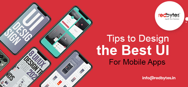
What glitters is not gold. But in case of mobile app design, the look speaks a lot to the eyes of beholders. Although design style and aesthetics are not everything, having a visually delightful and appealing UI is as important as the main substance and helps drive conversion. Combine the eye-catching look with amazing features and you have the recipe for delivering incredible user experience.

It is important, however, to understand the target market so that you can implement best UI design practices for your mobile app to enhance users’ interest and credibility. Based on our experience and research, we have put together a few essential tips to help you create highly engaging UI for your mobile app.

1. Users-centric approach

You must first prioritize user requirements and accommodate current market trends to create a wave for your mobile app. Gather all the details of target demographics using power analytics. based on the data, you can discern what they always needed and obstacles they face. You must think beyond the basic stats and discover the actual users of your app. The better design practice is to start with an MVP and watch users as they interact with it and encourage them to share their views. This will not only help you tune your app to their needs, but will help you make right decisions and minimize frequency of design iterations.

2. Technical details of design

a) Round cornered controls

There is no thumb rule of just sticking to rectangle pixels for UI elements. You can alternatively opt for roundish edges for the corners of buttons or other controls. Having pointy corners is an old custom in the world of mobile app interface. Round-shaped cornered action buttons and controls subdue the intensity of the interface and make it softer, more appealing and comfy for users.

b) Contrast for view

You don’t want to make it a painful experience for users as they navigate inside your application. The app content should be easy on eyes and effortlessly legible. To avoid awkward effects, it is good to include high-contrast colour schemes that create fine, clear content-friendly design. You can even go beyond system default colours and experiment with different variations.

 c) Size-optimized graphics

In order to optimize the available resources, developers often reduce their efforts by keeping one size for many devices. This approach can turn abysmal nemesis to your app’s overall appeal. To make it spectacular, make unique graphics to suit each target device screen. Device-specific graphics tend to load in time and results in stunning user experience.

d) Picture format suitability

The chosen picture format in app graphic may become inimical to the loading speed of the page. The size is often blamed, but the real fault is inappropriate format. The Android-compatible media formats include PNG, JPEG, GIF, BMP, PNG, etc. While PNG suits lossless images, JPEG is a good choice for editing. Each format has its own qualities and designer should know which goes where.

3. Finger-compatible interface

Make sure your app’s UI is finger-friendly. Mobile developers sometimes skip the consideration of keeping finger-compatible buttons with space enough to enable convenient typing for users. You must understand that human fingers are thick and may cause trouble while selecting options with a tap of fingertip. If app buttons are tiny or are placed too close, users will feel frustrated and may quit your app. Hence, your UI design strategy should emphasize optimizing the interface for finger-based interaction.

4. Smooth transitions

Trying variations in colours is a tricky job for mobile app designers. When the user is navigating, they should experience pleasant transition between the screens or and experience comfort while changing UI control states in the application. The approach of this sort maintains consistency and smoothness while switching from one state to another. Use eye-friendly animations and suitable colour combinations. This way, users will feel connected while making transitions. Also, with a change in button control colours, users can confirm their action after clicking on it.

5. Maintaining Simplicity

Simplicity of design helps ensure new users can onboard easily and start using the app without groping for detailed guide or tutorials. This does not necessarily mean adopting minimalist design style. The simple UI allows users to execute the action and reach their goals in minimal steps. Certain variations in colours, buttons, spacing pattern, fonts and navigation path are all critical factors that go into making easy-to-understand interface, enticing more traffic to your mobile app.

6. Back button and Fonts

Back button is meant to shepherd users back to the previous page consistently. Being an app designer, you can either leverage the native OS back button (the default choice on the device) or develop a back button at the top-left corner of UI as often seen in iOS apps. This approach helps you incorporate users’ impulsive tendencies for quick navigation.

As for fonts, it is wise to stay away from using anomalous or bizarre fonts that often drive users away. Such practice discourages the real motive of UX and drains users. Instead, include fonts that are both spectacular and readable. Keep the font size optimized (usually 12pt and above) to both screen as well as users’ viewing experience.

7. Emphasis on clutter-free interaction

If you have powerful data analytics to monitor user journey through your app, you can effectively judge what features are most welcome by 80% of users. The task becomes easy especially when your mobile app is the direct extension of an online website. This fundamental is based on 80-20 principle that defines the 20% of app frequently explored by 80% of users. Apply this 80-20 rule so that you can easily identify the features that are redundant from users’ perspective and retain those that are compelling to ensure clutter-free interaction.

8. Relatable icons

In the last 5 years, there has been a tremendous advancement in the way mobile app UI icons are presented to users. A whole new range of icons have risen to enable more comfort and luxury to users who are always curious to try something novel, unique and relatable. Hence, UI designers looking to score better should develop relatable icons that create intuitive appeal and effortless user experience.

9. High resolution

Modern smartphones usually offer in-built support for high resolution that creates impressive picture view and enhances user’s interactive experience with interface. If you wish to acquire and engage more users, make sure your interface design is perfect for high resolution images and shows vivid picture quality to the audience. You can opt for images with 264 ppi or better to bring out stunning interface and amplify the clarity especially if the target devices have large screens.

10. Effortless error notifications

A phenomenal mobile app UI is the one that minimizes user’s side of efforts while identifying the errors. In the event that the error strikes, the UI design must reduce users’ guesswork and clearly notify them of what went wrong while performing an action. Users will be delighted to have clear guidance about how to rectify faults and things gone wrong while interacting with the app interface.

Conclusion

To build an attractive UI for mobile app to user’s tastes, mobile app designers must delve into the target market and scoop up the essentials. The second important aspect of brilliant app architecture is following the guidelines for user-friendly, business-specific interface.

To ensure massive usability, your product should be easy on eyes and create positive appeal on minds. Hopefully this post will help you develop deeper insight and excellence required to construct an outstanding user interface for a competitive mobile app.

Mobile app developers across the globe will agree with the fact that the development of user friendly mobile apps calls for a lot of forethought. It is through this farsightedness that you can create apps that can rank high on their user experience. Here is a rundown of do’s and don’ts that you must consider while designing your mobile app. Once you keep these pointers in mind, you will be able to attract the attention of app users in more ways than you can imagine.

Firstly, let us shed light on what you should do to churn out a user-friendly and appealing mobile app.

The Do’s

1. Research – A Data Collation Spadework

Most of the apps fail because the developer does not research before designing them. Hence you should resist the temptation of skipping the most important task of researching and abstain yourself from jumping straight to the designing process. Researching includes that you spend time conducting a competitive analysis.

Researching supports you to work in the direction of a blueprint that you have come up with, keeping user experience as your mission statement.

2. Enlist Crucial Mobile App Characteristics

The next thing that you should do is to come up with priority features. It is a matter of excitement for developers to add many features to their apps. However, this clogs the basic intention behind a clean user experience.

You will have to decide and stick to important features that will better impact your users while doing away with such features which are good-to-have.

3. Support Every Click With Feedback

For every user input, it is important that you provide some feedback so as to direct your users to a state of process completion. Only when your app provides feedback will your users be rest assured that the desired action was performed. Without feedback, your app will keep your user guessing whether the intended process is complete or unsuccessful.

4. Do Away With Unnecessary Clutter

Too much information can spoil and complicate user experience. Cluttering does more harm to mobiles with smaller screen space when compared to desktops which have wider screens. Here, your aim is to stick to minimalism. It is best to include content that can impact your users, discarding all those elements (unnecessary images, buttons and texts) which clog the mobile screen.

5. Legible Text Drives Usability and Readability

Content is what drives your users to pick your app. The text that appears on your app is part of the content that demands attention. You should hence ensure that your text is legible so as to come up with a user-friendly mobile interface. Choosing a legible font size is a recommendation that should be given serious thought.

6. Navigation Should Be An In-Built Feature

The compelling content in your mobile app should be evident so that users locate it without any additional efforts. In view of this feature, it is important to come up with navigation patterns that are familiar to your target audience.

7. The Lesser the Typing, The Better It Is

You as a mobile user will agree with the fact that, typing on a mobile is a tiring and error-making process. Hence, the smartest tip is to minimize the typing on a small mobile screen. Removing unnecessary fields will be an intelligent move in the direction of allowing users to give you the information that you need to know.

8. Offer A Seamless User Experience Across Multiple Devices

You should not go by the idea that mobile apps offer stand-alone experiences. For a user handling multiple devices including tablets, desktop or mobile phone, he/she expects your app to provide a seamless experience across all devices.

9. The Use of Finger-Friendly Taps

It should be your objective to come up with ample touch targets for all interactive mobile desiogn elements. By doing away with smaller touch targets which lead to mistaken taps, you will be able to address the most common problem faced by mobile app users. Thus it is recommended that you include targets that are big enough for users to tap.

10. Test Your Design

A real world implementation of your mobile app will help you come up with unseen flaws that were masked during app development. Hence the trick is to test your design with multiple real users so as to work on their feedback. Their pointers will thus become your guiding light to come up with an app that only appeals to users but is also effective.

Let us now move on to the don’ts that dampen the mobile app user experience.

1. Don’t Strive to Get It Right The First Time Around

Try and try till you succeed. In line with this common adage, it is important to keep in mind that it is difficult to come up with a perfect experience with your first attempt. Even after meeting all you mobile design requirements, there is every possibility that you will step on a new set of requirements that have emerged after testing the app. Hence it is advisable to adhere to an iterative designing pattern and test your app early on.

2. Don’t Drift Away from Customer Needs

Once you start focusing on meeting customer needs, you will not get carried away by an idea that looks lucrative on the face of it but fails to deliver any benefit to users. Only when you spend time validating your design theories based on what your target audience wants, you will be in a position to work around a feedback loop that permits a solid mobile app design.

3. Jargon – A Big “No”

User interface which is devoid of jargon appeals to users. When your app starts conversing with users in the language they are comfortable with, the interaction between the interface and the users is simplified. Here, you should abstain from using words that are beyond the understanding of users.

4. Avoid Seeking User Permissions Right At The Start

It is a common phenomenon with many apps that were just downloaded to seek user permissions in the beginning itself. Such questions can discourage and confuse users who will in all probability deny such a request.

5. Abstain from Using Custom Gestures As a Primary Means to Interact With Your App

Instead of offering custom gestures to interact with your app, it pays to come up with standard gestures for shortcuts. Since users are familiar with standard gestures, they need not expend any effort to learn or recall them.

6. Users Should Not Be Kept Waiting for Content

Users’ reactions like unrest and frustration will set in when they are kept waiting for content. A black screen that pops up when the content is loading can dampen the user experience, giving an impression that the app is stalled.

7. Dead End Pages Are Best Avoided

You should be mindful of the design flow concerning user experience. Your app, with every action should move in the direction of accomplishing a goal. In this regard, you should avoid creating dead-end app pages that hamper the user flowassuch pages not only confuse users but also lead to unnecessary actions.

8. Avoid Tagging the Web Experience on Apps

If you noticed, web browsers work through links. On the flipside, it is buttons that drive mobile experiences. In line with what users expect with regard to interface elements and interaction patterns in mobile apps, you should avoid underlined links in mobile apps.

9. Don’t Lead Users to a Browser

It can be terribly frustrating for a user if the app leads him/her to a web browser, during instances requiring to either complete a task or those that seek additional content. Such an occurrence will reduce conversion rates.

10. Seeking User Feedback During Their First Experience – A Strict “No”

mobile app development company

Notwithstanding the fact that user reviews and ratings are the important data points for the success of your app, it is through such feedback that users will either choose to download or skip an app. At times, the frequency with which the app seeks user reviews can also annoy the users when they are interrupted while performing an important function.

Closing Thoughts

With new mobile apps mushrooming with each passing day, the expectations about user experiences are increasing manifold. In an attempt to sustain competition and meet the varying needs of users, you should come up with an app that is not only useful but also valuable and relevant to your target audience. Hence, the above 10 do’s and don’ts will help you attain the objective of a promising mobile app that ranks high on usability and user experience.